
Revolutionizing Left Bank Books
Creating a streamlined, ethical e-commerce experience for an anarchist collective bookstore
Duration 2-week sprint
Tools Figma, Zoom, Optimal Sort, Whimsical, Google Slides, Sheets, Docs, Photoshop, Illustrator
Project Type E-commerce, Website Redesign, Personal Development Project
Project Overview Using various research methods, I identified areas of improvement and redesigned Left Bank’s e-commerce experience with their unique ethics and values in mind.
Project Brief My objective was to optimize my client’s e-commerce experience to help them stay competitive during these challenging times.
THE CHALLENGE
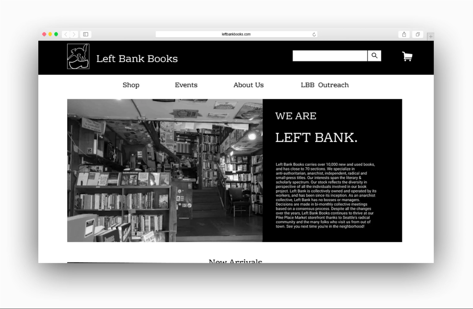
Since 1973, employee-owned and operated Left Bank Books has stood proudly in Pike Place Market. Decades of technology and a pandemic now stand in the way of customers and Left Bank’s more than 10,000 unique titles.
Left Bank’s current website, viewable here, doesn’t impart the same unique and community-oriented experience that in-store patrons have come to know and love. The website navigation and search mechanics are outmoded - leading to shopper frustration and cart abandonment.

PROBLEM STATEMENT
How might I digitally represent Left Bank’s anarchist values while improving their website’s clarity and navigability?
KEY RESEARCH METHODS
UX Research Methods 01: Heuristic Evaluation
I evaluated Left Bank’s web experience for compliance with basic usability principles.
Using Nielsen Norman Group’s 10 Heuristics, I conducted a thorough analysis of the current site. I identified 26 heuristic violations. I've listed five of the most critical usability problems below.

UX Research Methods 02: Hybrid Card Sort
I investigated users’ expectations around global/local navigation and content accessibility.
Left Bank’s current experience breadcrumbs small bits of information across too many pages. Using OptimalSort, I found that users most commonly grouped information and other navigational elements into four categories:

UX Research Methods 03: Competitive & Comparative Analysis
I needed to know where Left Bank was falling short in comparison with local, regional, and global competitors.
I compared Left Bank’s web experience to Elliot Bay, a promising local, Semicolon, an independent bookstore with a similar customer base in my area, and best in class, Amazon and Barnes & Nobles. I identified 3 major features missing from the LBB shopping experience.
🔍
Advanced search tools
👩🏿💻
Customer reviews
📚
Expansive descriptions
RESEARCH TAKEAWAYS
During task analysis, I discovered...
At both Barnes & Nobles and Amazon, it took a user 4 steps to find a book they’d be interested in purchasing. On Left Bank’s website, it took the same user 18 steps.
These and other research methods helped me identify and later address the following problem areas:

THE SOLUTION
By simplifying/re-organizing global and local navigations and adding consistent visual elements, I will achieve improved discoverability and a more streamlined user experience.

KEY FEATURES
Key Feature 01 — Homepage

An informative, functional homepage.
This page features a simplified global navigation, warm introduction and bit of history on Left Bank Books, and shoppable content on the very first page. Below, customers can stay up to date on all things LBB by reading about their philanthropy and important announcements.
Key Feature 02 — Product Details Page

A one-stop shop for description and details.
After clicking on a title, users can easily view all the pertinent details, including customer ratings, format, and availability. Lower on the page, users can find descriptions, publisher information and more. Some popular titles from the same genre can be found just below. (These suggestions aren’t based on other users’ purchases because LBB doesn’t harvest customer data!)
Key Feature 03 — Shop Page
Like perusing the shelves, but online.
The Shop page effectively uses available space to promote LBB events and programs. I’ve also upgraded the shopping experience by implementing filter tools and local navigation. Users can easily search by genre and/or filter by price or customer rating.
Key Feature 04 — Checkout Flow

An alternative checkout option.
LBB’s current experience only allows customers to checkout using Paypal. Considering that LBB’s clientele value their privacy, a native checkout option allows users to feel more in control of their personal data.
NEXT STEPS
01 - Curbside pickup
A popular choice during this pandemic, customers can call in for pickup orders. I would make this an innate option within the checkout flow.
02 - Natural mapping
If given the opportunity to work directly with Left Bank, it would be beneficial to review their digital genre categorizations and build more thorough search tools based on their in-store shelf organization.
03 - Branding
Left Bank enjoys a prominent position in Seattle literary and radical communities, it would be advantageous to create a stronger visual identity system to represent this prominence.
04 - Increase fidelity
I would explore UI elements (and color!), as well as building out lower priority pages, like ‘About Us’, ‘LBB Outreach’, and a functional ‘Events’ page.

WHAT I LEARNED
🤘🏾 A whole lot about anarchism
I was challenged during this sprint to design within the ethical and cultural ramifications of an anarchist collective. Being unfamiliar with the radical community, I did my research and thought critically about Left Bank’s unique needs.
🛒 The level of detail involved in e-commerce
This being my first e-commerce redesign, I was surprised at how impactful the smallest interaction or design decision can be on the overall customer experience.
⚡ The ins and outs of Figma
I enjoyed Figma’s intuitive interface and easy online collaboration. I got live feedback from my peers and was easily able to pick up where I’d left off designing.